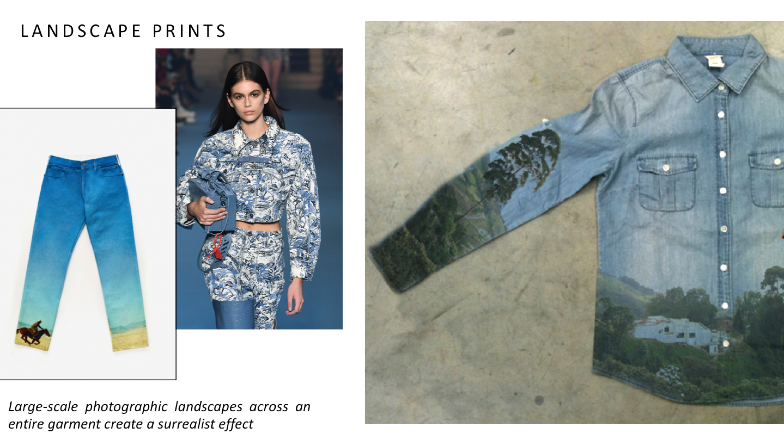
Color & Pattern Interview Series: Liv Aanrud
Screen Shot 2020-07-08 at 2.24.38 PM.png

Artist: Liv Aanrud

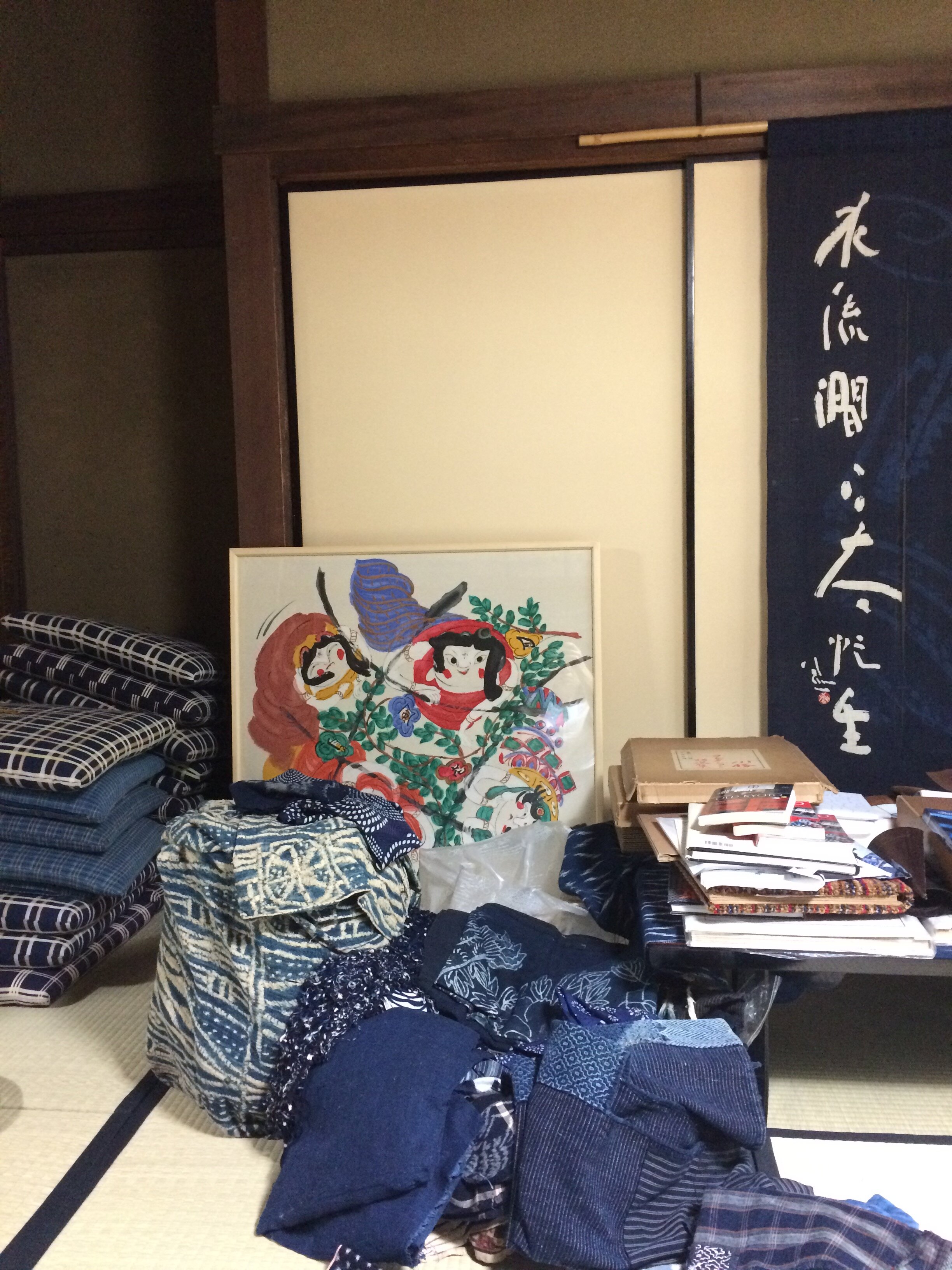
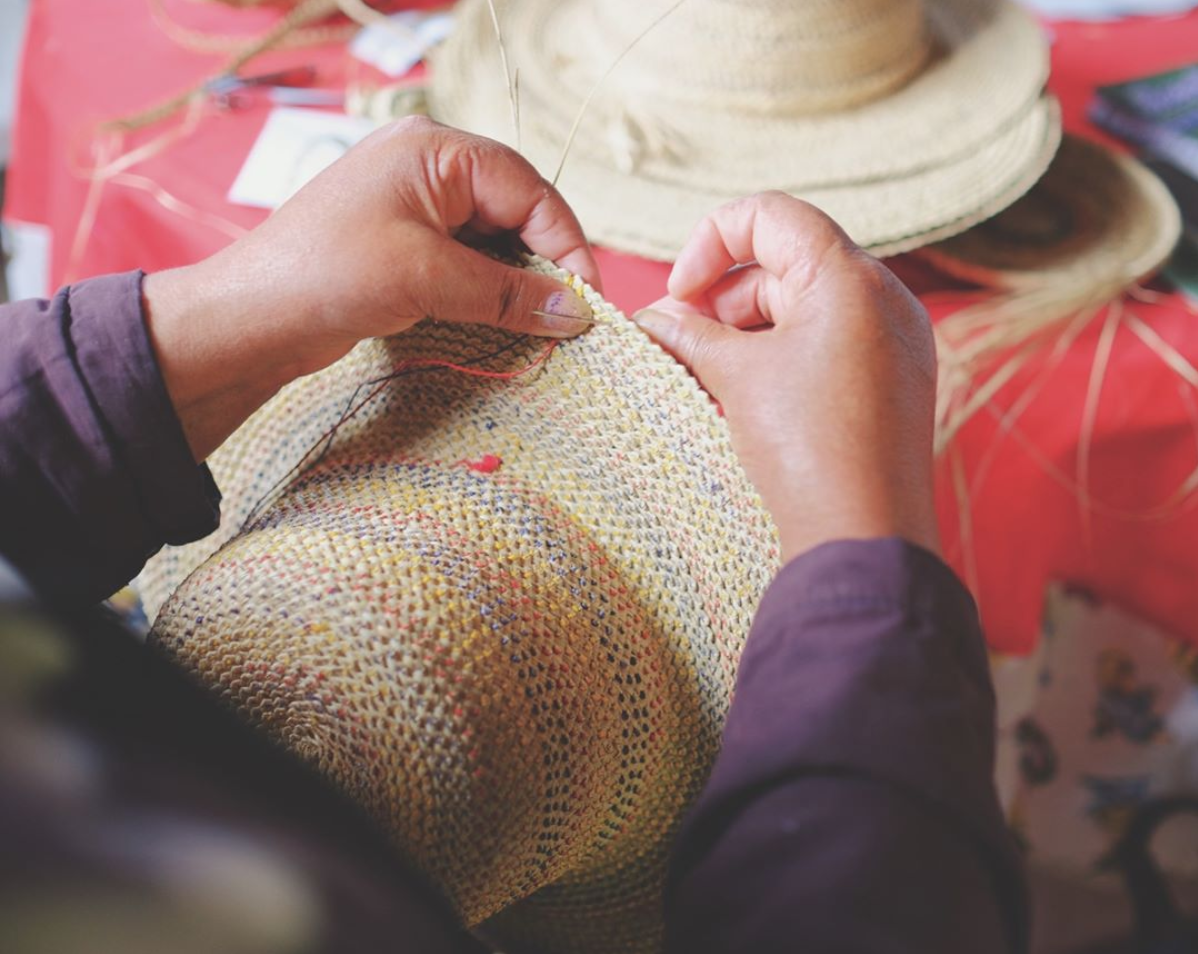
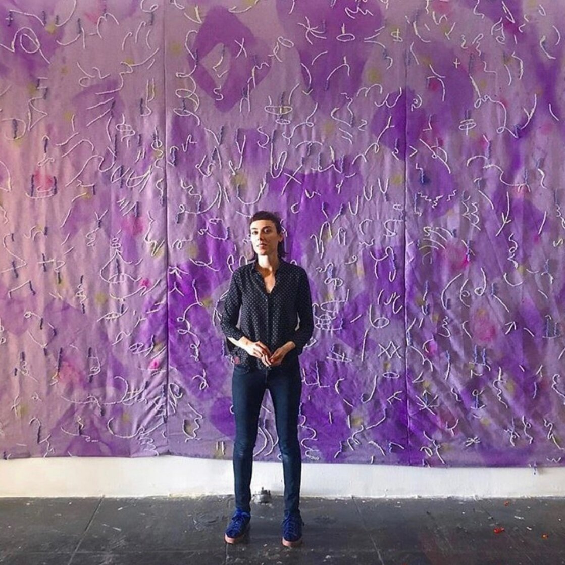
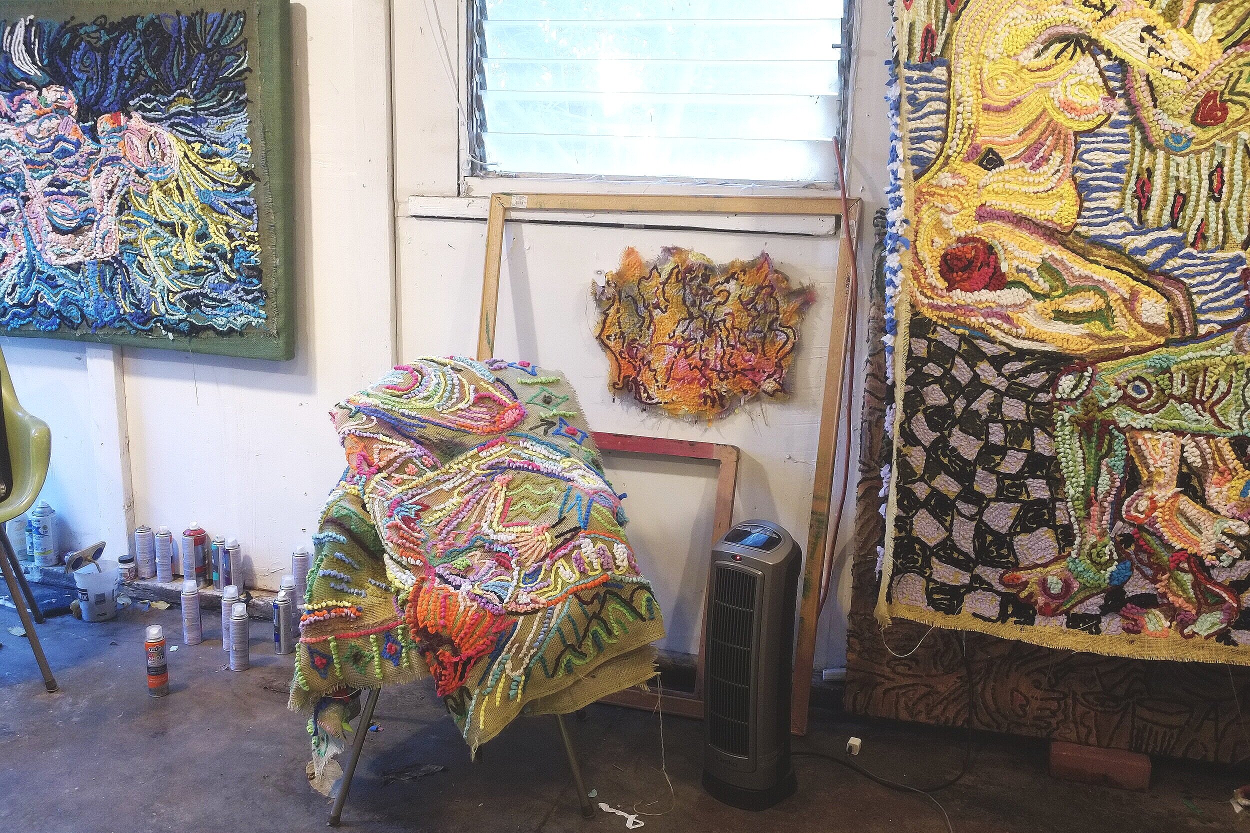
Liv Aanrud and I go way back…to a tiny Wisconsin town of less than 1,000 people where we both grew up and attended school together (in a building that housed K-12 grades!). We were lucky to be brought up in a place that nurtured creativity. As children, Liv was always sketching or making something imaginative and whimsical. You could give her anything and she would make incredible art from it. Now based in LA, we reconnected as I started traveling there for work. Before the pandemic she invited me to her studio several times in Frogtown (side note: she was there well before it became hipster cool) and I was struck by her latest work of rag rug hooking.

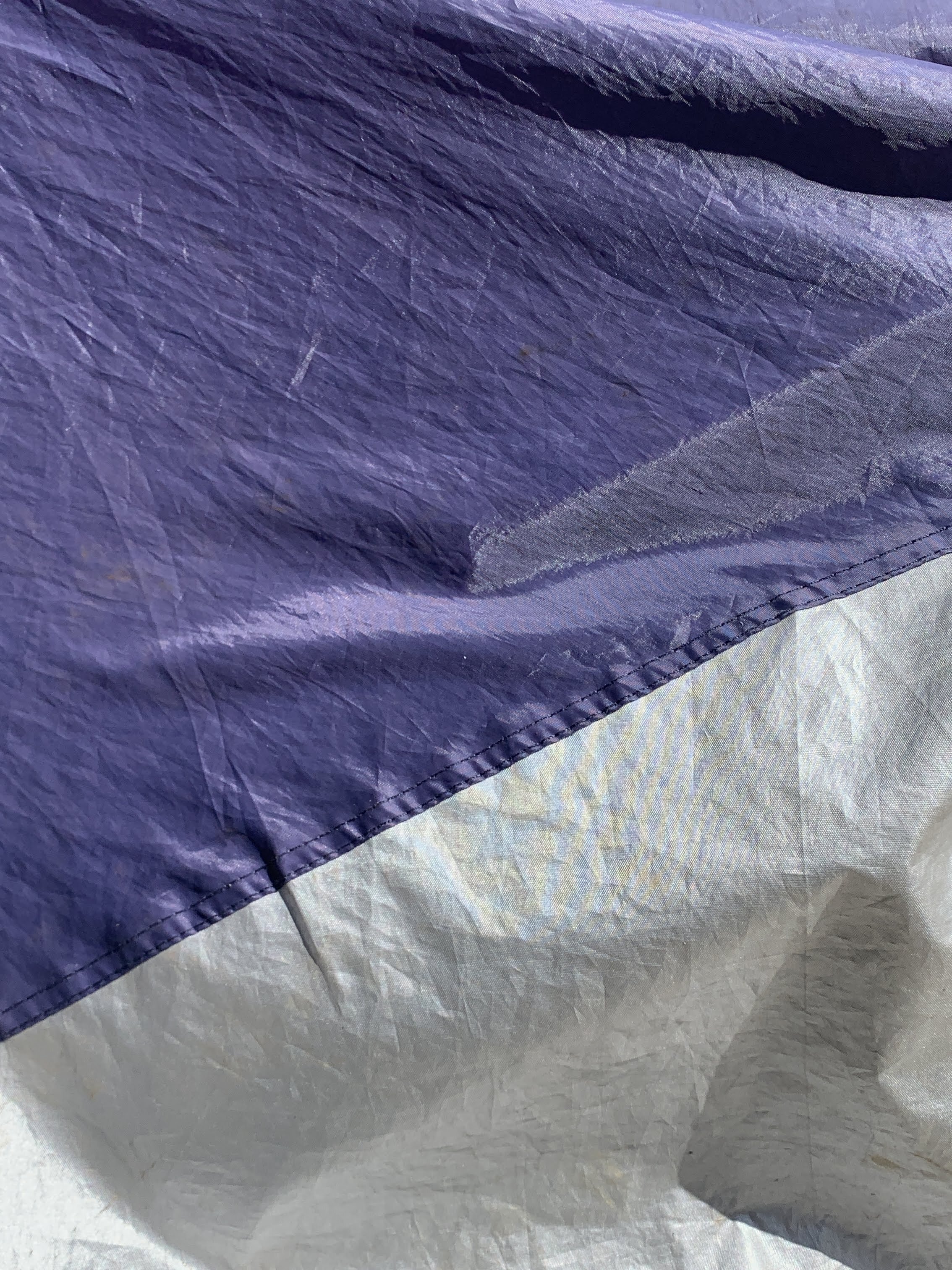
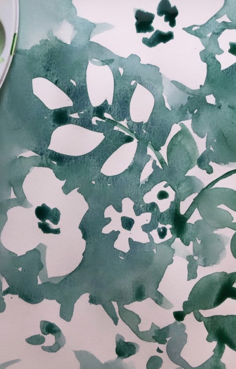
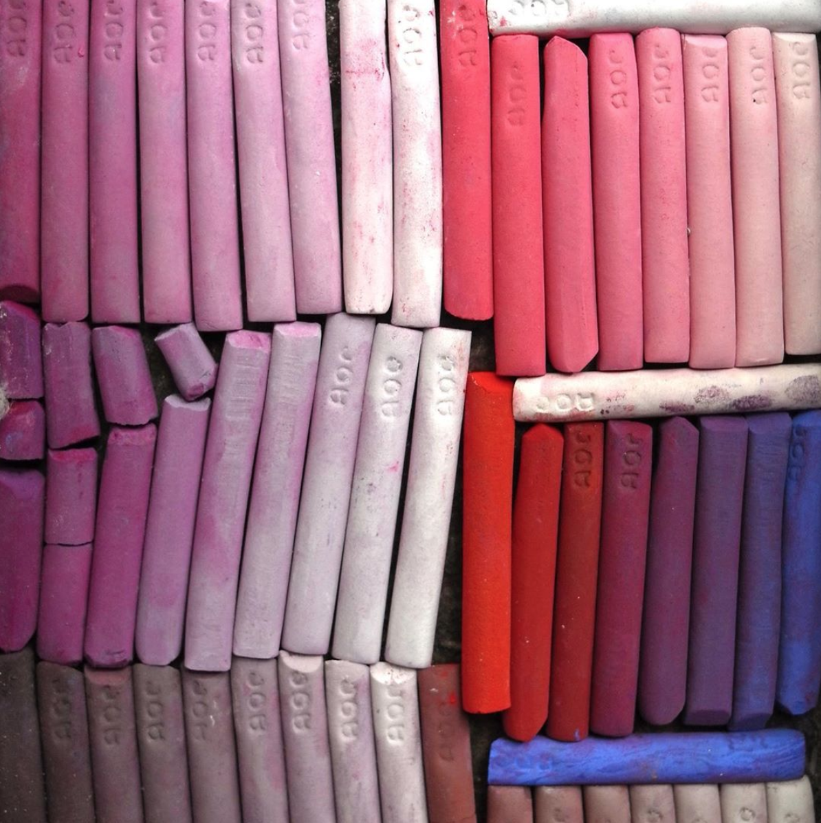
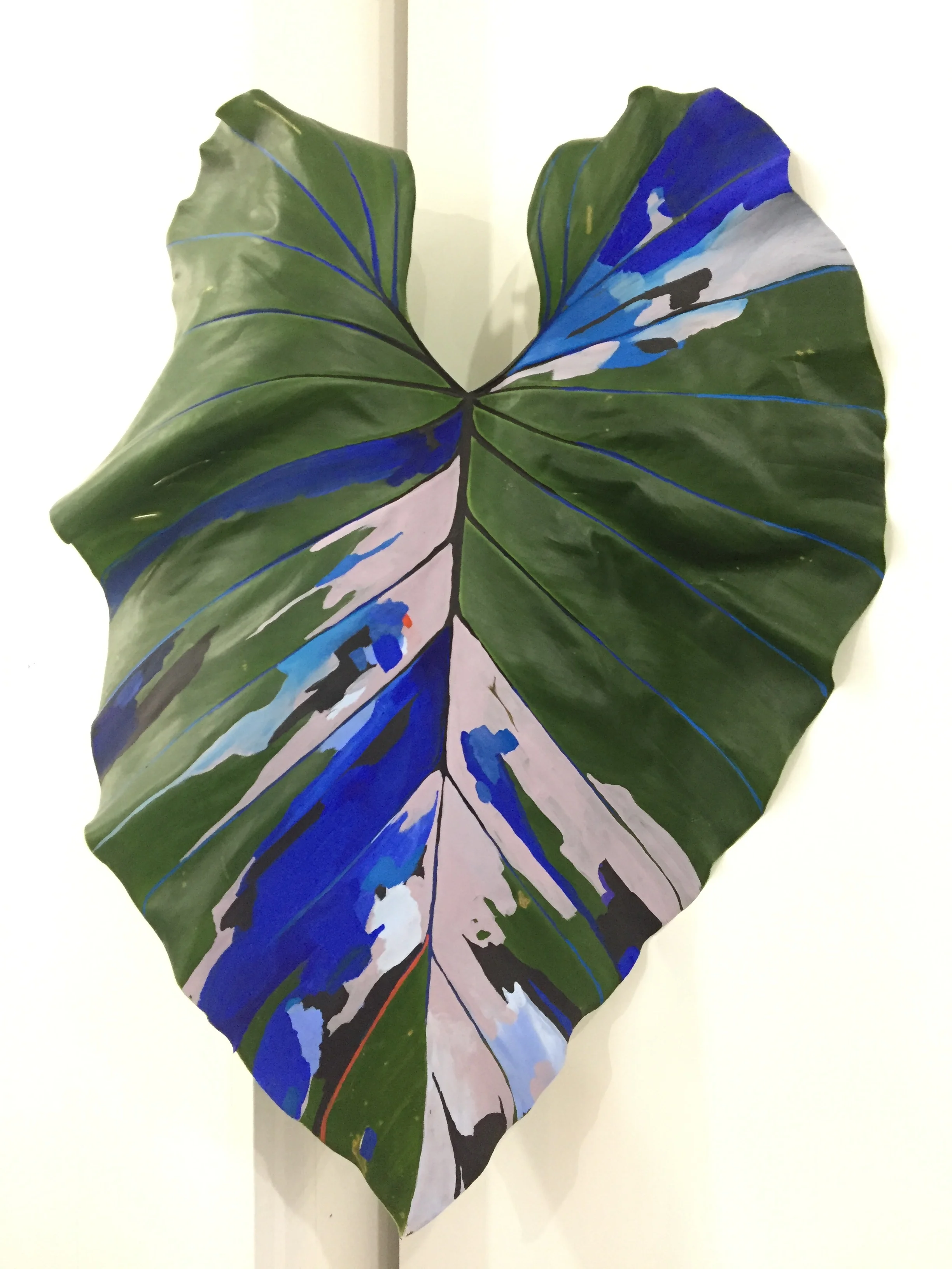
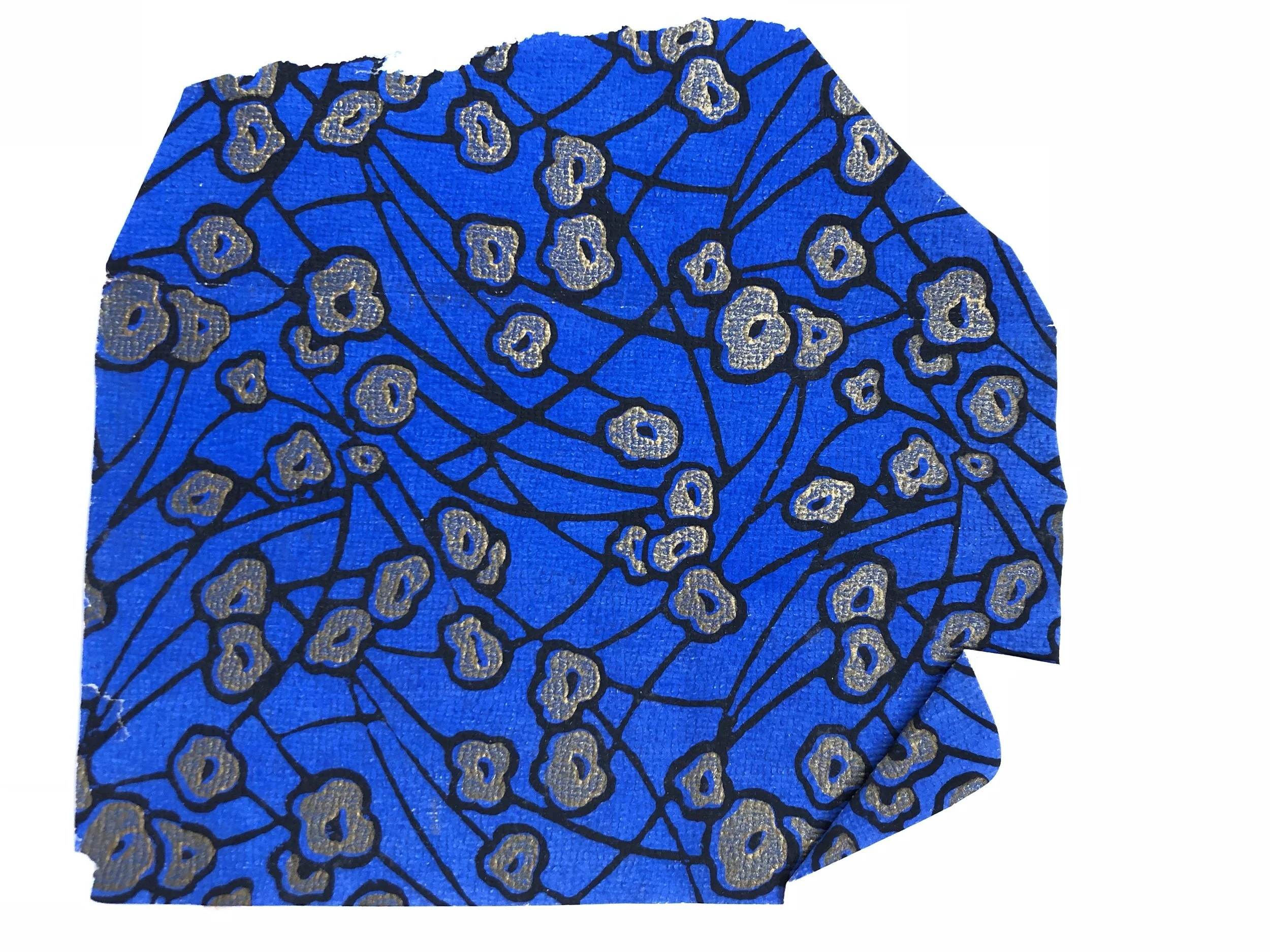
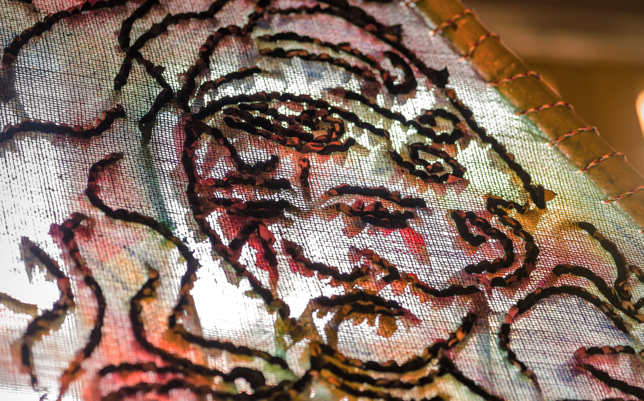
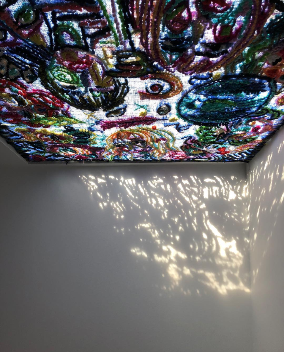
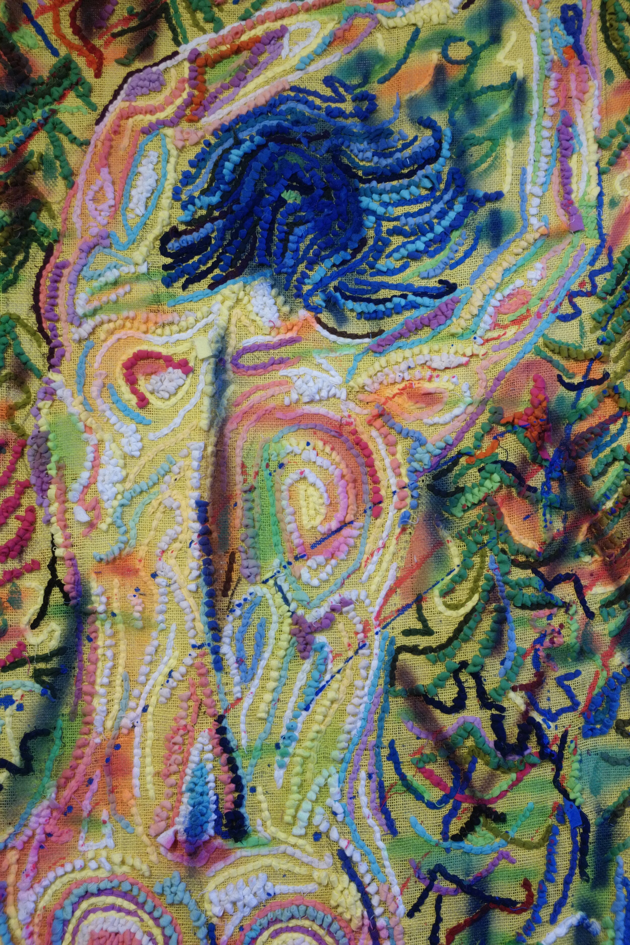
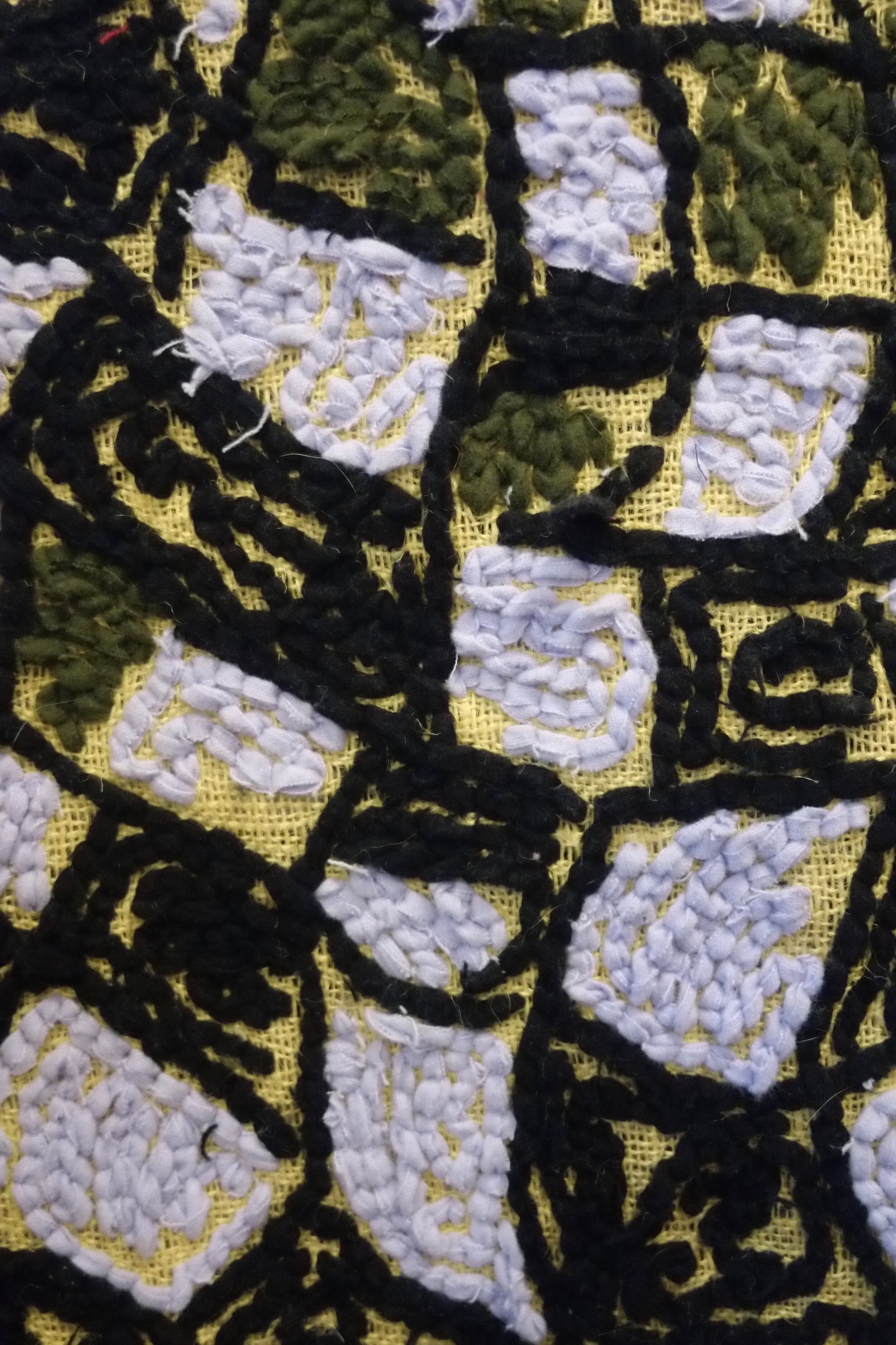
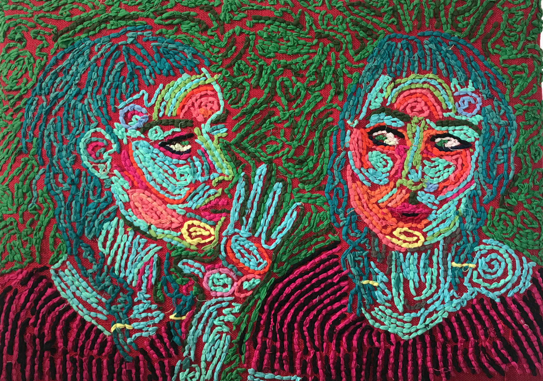
Inside her studio, strips of felt bursted out of bags, all to be woven into her larger than life tapestries. There is a methodical and slowing down process when viewing her work because so many colorful details make up the whole. Up close the texture of the felted loop is immediately seen, and from afar a scene unfolds with images of flowers, trees, and people.

As stated on her website, “Aanrud's work is at once a slowly stitched drawing and a labyrinthine map of the act of thinking.” I couldn’t have said it better. It’s a wonderland that you get to step into, following her map of color, pattern and storytelling.

Step into the fantastically vibrant world of Liv Aanrud:

1. From ever since I can remember you’ve been an artist of many mediums, which I love. Your style and technique of rag rug hooking is an art form I don’t often see. How did this technique come about?  What do you enjoy about creating art in this style?

My undergrad study was in painting, and I was an abstract painter for many years, although I often made other types of artwork along the way. I did portraits, metal work, illustrations, signs, murals….I try not to have a hierarchy as to what I value---I’m really into the process and challenge of making something and learning what is possible along the way. When I was in grad school, right after my thesis show, I discovered this old rug that my grandmother had made. To me it looked like a beautiful painting, it was abstract and really in line with the kind of work I had been making—such kismet! I began making paintings, “portraits” of it, and then I decided to teach myself how to make one. That was almost 10 years ago. I love that this medium can somehow look like a painting, a drawing, a mural, a rug, or a sculpture. I can create something recognizable like a figure, but within it is an abstract landscape of forms. I also love the “work” of it---the repetition of stitching is meditative---especially these days when I feel so idle and anxious about the state of things.

2. How long does it take you to make these pieces and can you take us through the process?  (Are you basically drawing with the fabric as you go or creating a stencil or outline to work around first?) 

It’s a fairly laborious process, although I immediately lose track of time, so I never manage to get an exact timeline. I work pretty fast and compulsively when I have something I’m excited about, so if I have to average, maybe two or three weeks on some of the mid-sized pieces, but I’ve worked 6 months on others. I usually start with a very small, simple sketch—--I try not to hold too tight to any details, I just kind of get the big idea down. I’ll draw it out loosely on burlap, and maybe 10 minutes later, jump into the stitching. It’s an odd negotiation to have such an impulsive start followed by so many hours of work, like my mind and my body have to work at completely different paces!

3. What are the themes that often come up in your work?  How have they changed now due to the pandemic?

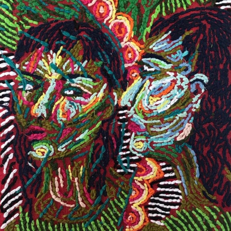
Initially, my tapestry work was abstract. There might be some figures, words, or symbols in the piece, but it was all obfuscated by the end, kind of like a magic eye puzzle where you might get a flash of something, but you can’t really see it for long. Lately, I’ve been doing figurative work--- that was kind of a leap at first because I wasn’t sure what the “story” would be. But as I kept working, I realized that the figure is a kind of stand in for my own experience. So yeah, the last few have been about isolation, anxiety, and reflection. Since you’ve sent these questions, we are now experiencing massive protests against police violence, helicopters fly overhead constantly and my house is across the street from the police academy so it’s very tense and overwhelming, but I’m also incredibly hopeful that this is a major shift in consciousness. What does that mean for my art? I haven’t been able to make anything yet, I don’t know if that’s the right thing to do now, but I have been trying to make some wearable pieces….thinking more about costume, armor, masks, protection, rituals, processions…

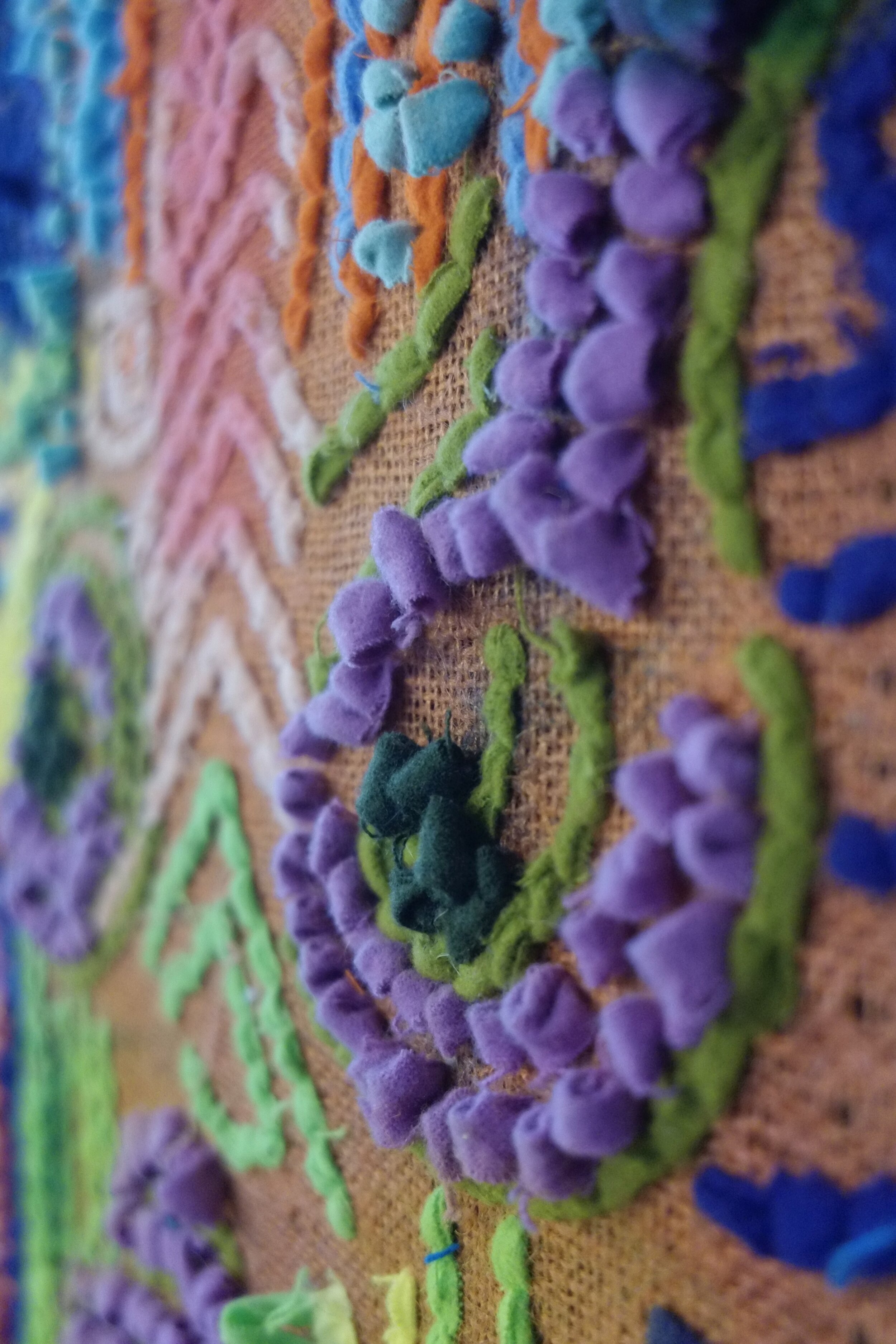
4. You use a lot of color in your pieces.  Do you gravitate toward using certain colors in specific ways or just going with the flow?  How has your color evolved over time and any new color themes you might start playing with?

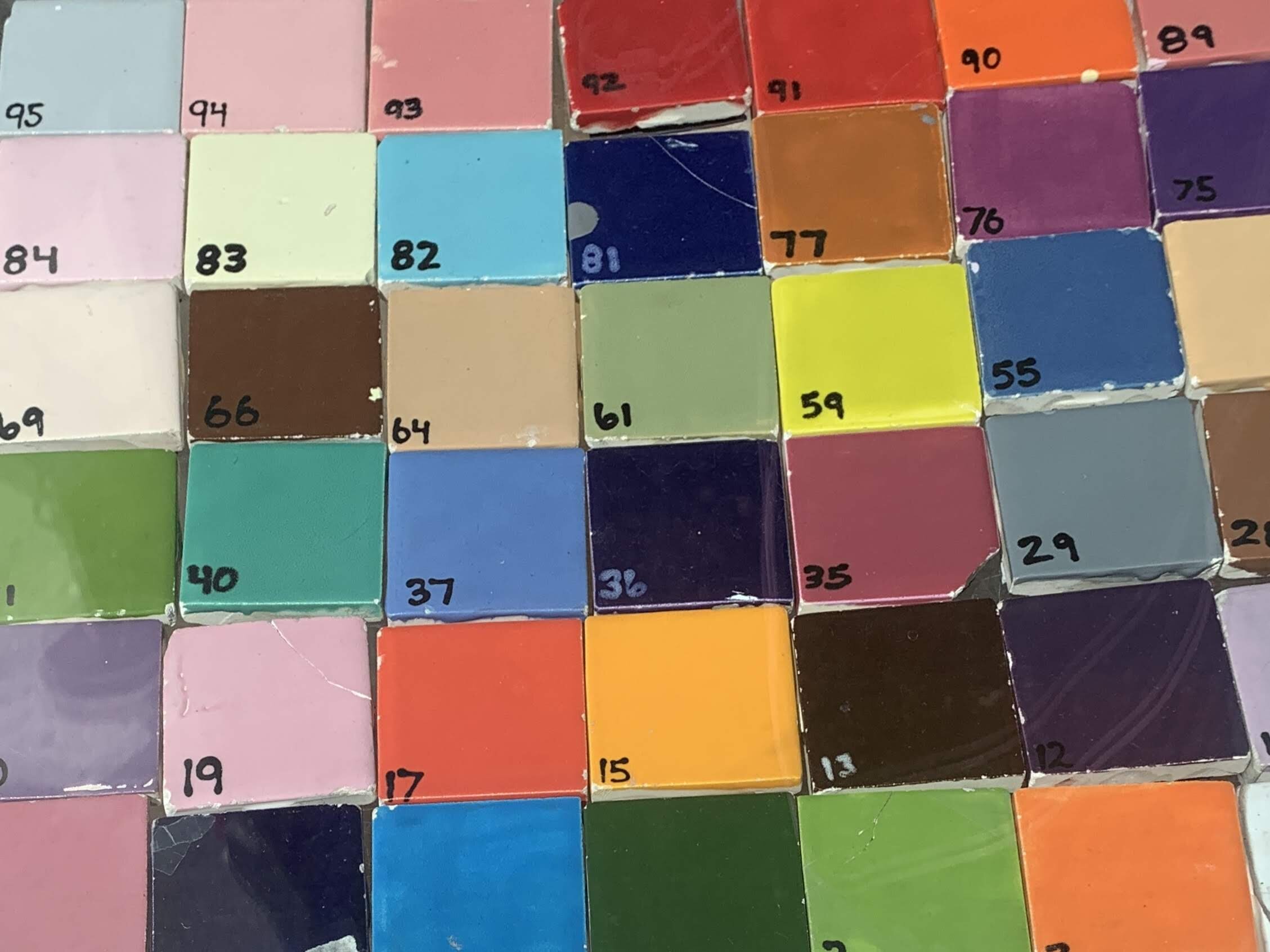
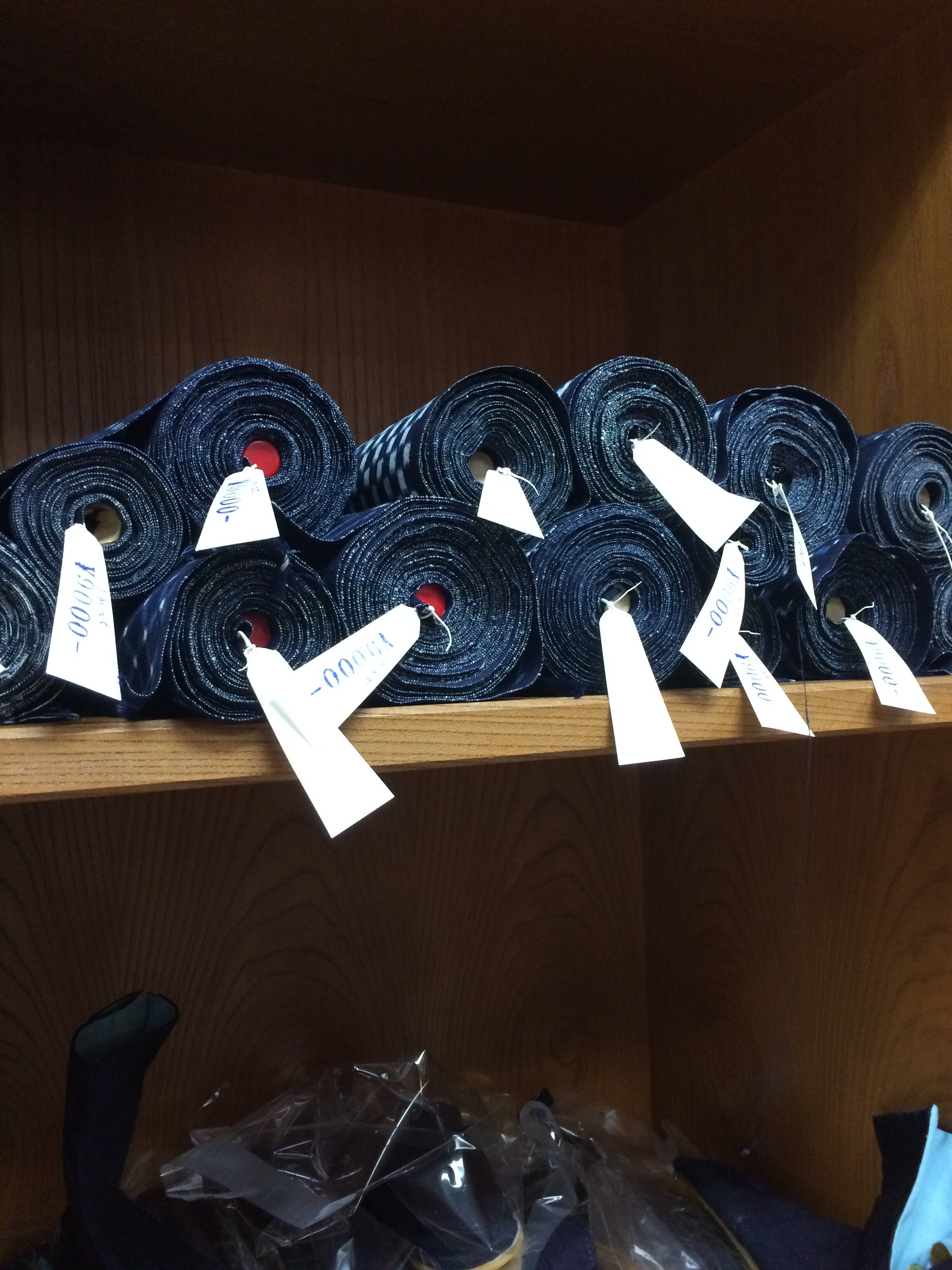
I buy fabric (burlap and flannel) so in some way, the commercial colors dictate my palette—normally flannel is used for baby blankets, so there’s a lot of pink, blue and yellow choices, but combining them, layering and patterning them changes any predictability I might have. I like bright colors, combinations that might clash a little…there’s always a point in every piece where I question what I’ve done color wise, and then I end up figuring out how to make it work.

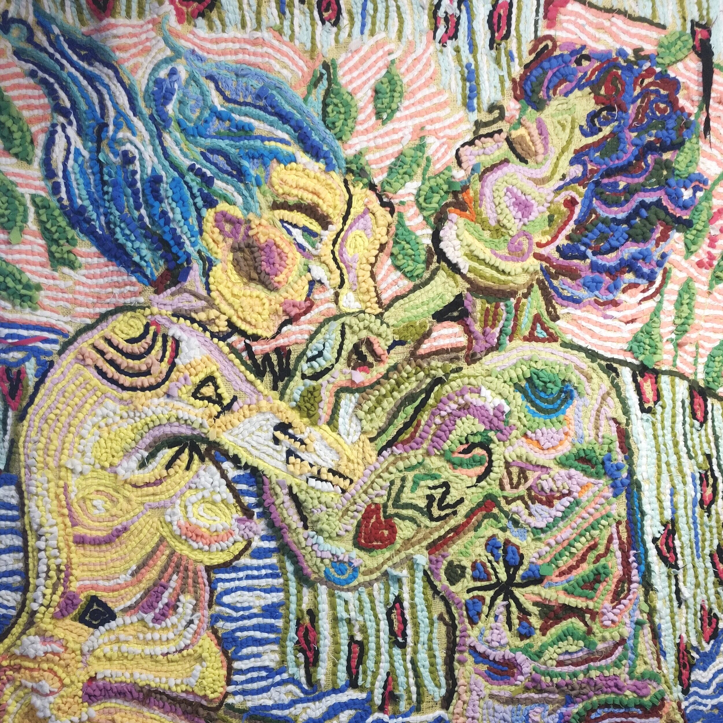
5. I love your work because there are patterns and details within the larger image and one has to pull back in order to see the actual scene being depicted. Has that always been intentional to have textures, patterns, and illustrations throughout the entire piece? Do you choose particular patterns based around their history or meanings to fill in the spaces around the scenes? Any new patterns you want to start using in your work?

The stitch is a pattern in itself, so as the piece builds, there is a natural rhythm. If I’m weaving something particular---a body, a plant, a flower—then I do sort of apply a logic within it---a leaf might have two colors of green alternating, a knee might be radiating with circles of varying colors- --the line follows some aspect of the form. Lately, I’ve been doing figures in a domestic setting (quarantine!) so I’ve begun adding patterns and textures that one might find in their home, on pillows, blankets, wallpaper or carpets.

6. How has your work evolved over the years? Any new techniques you want to try out or add to your current frame of work?

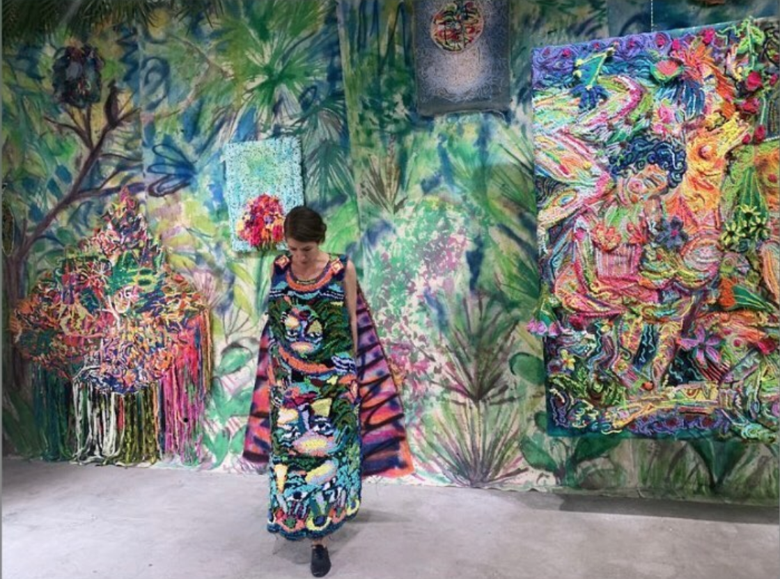
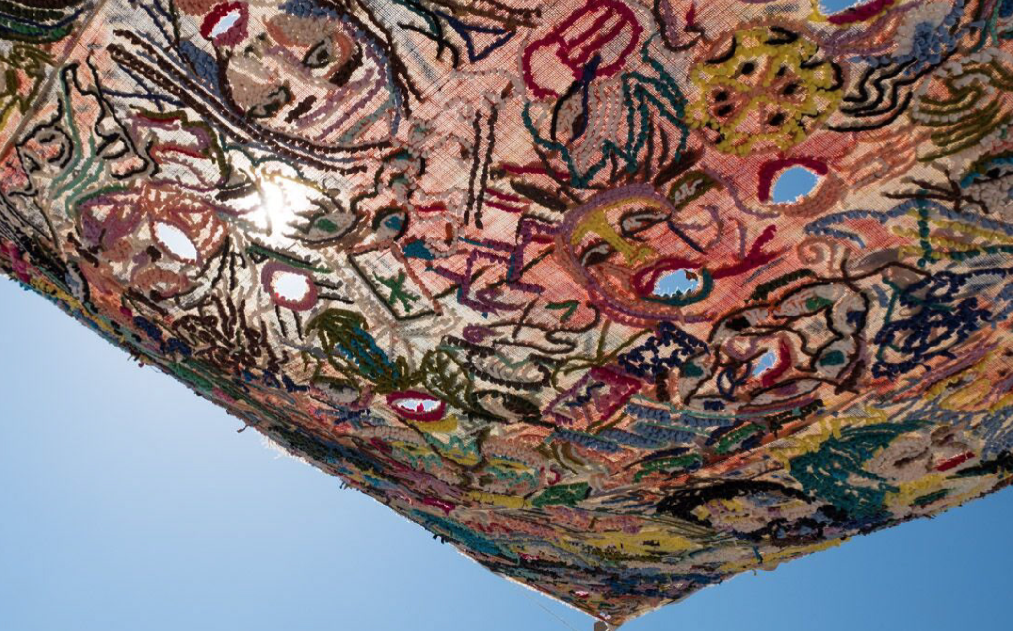
The tapestry work has evolved initially I used to simply weave—the entire piece would be packed with stitches, then I started painting on the background, and weaving into that image. Lately, I’ve loosened up the space, there is more room between the stitching--giving it a stronger sense of line and closer relationship to drawing. I have also experimented with installation--hanging work outside, combining older pieces and stacking them on new ones; I had a recent show where I made a huge backdrop painting, with layers of pieces--some were hung out in front of others on ropes. I’d also made a wearable piece and had a friend do a performance in front of the whole exhibition. She moved through and around the pieces, swinging the ones on ropes---the whole thing was activated—A big moving world of weaving. That was really exciting and I want to develop this work in the future.

7. How do you see the art world changing because of the pandemic?  Any thoughts or hopes you want to share?

I do. I mean, the initial changes have been practical---online galleries, viewing by appointment, outdoor shows… but I’ve also seen a lot of movement towards supporting local programs, charities, organizations that support communities and workers. Many artists don’t have much security financially, so selling work and donating it to a particular cause is way to have in immediate impact. Unfortunately, I don’t think we’ve fully seen what effect will this will have on gallery spaces---I expect some won’t be able to manage—we still haven’t had any rent or mortgage freeze, and $1,200 for three months and counting? Impossible. I know that this world is going to look very different on this other side of this ---people are coming together to fight back, but the reality is devastating.

Abigail Cook
Eye Spy - Color in Quarantine

About halfway through lockdown, (in one of my newsletters) I had asked everyone to send me photos from their daily walks. If you recall, to my surprise we all saw green, which I still can’t believe!

I wanted to give a special shout out to one of my fellow trend forecasters, Sophia Ahmad, who sent me a bundle of photographs she took on a recent walk around her Boston neighborhood. During quarantine she started exploring streets that were new to her and found herself photographing playgrounds that were empty of vibrant life. She was drawn to the exposed colors, textures and shapes typically covered with laughing children tangled up in a real life game of Candyland. The colors ranged from pastels of abandoned chalk art to the most saturated purples and reds. I also loved how she photographed tarps, basketball courts and walls with a zoomed in perspective, which captured negative and positive shapes.

During my quarantine I also found myself looking closer at the details in my neighborhood of Gowanus, Brooklyn. I’m usually not drawn to bright colors, but similar to Sophia, when I found myself devoid of stimulation in a lockdown, strong colors and shapes called my name. And once I found one color blocked building, it’s all my eye could see.

Trend forecasters are always looking at the world in new ways and translating what we see into tangible ideas. Imagine what our photographs below might be transformed into? Color palettes, prints/patterns, design details….the possibilities are endless.


Boston, MA


Gowanus, Brooklyn

Abigail Cook
Color & Pattern Interview Series: Kneeland Co.
Screen Shot 2020-05-19 at 1.57.13 PM.png

Kneeland Co.

A peek inside the vibrant world of Joanna Williams…

About 10 years ago I stumbled upon Joanna Williams’ blog and immediately knew I had found a divine, magical world. At the time, her blog was filled with bold patterned textiles, inspiring far-flung places and color palettes that I couldn’t stop thinking about. When I found out that Joanna had previously been a fashion trend forecaster, I knew she was someone to pay attention to. This was a woman who had a voracious curiosity about the world like myself and therefore translated that curiosity into her business. Over the years her company, Kneeland Co. has grown to become a creative consultancy, textile studio and newly opened boutique in Los Angeles (called Kneeland Co. Rarities). We have followed each other on Instagram for many years, but it was only recently that I met her at one of her previous pop-up shops (before that idea turned into the permanent location) and Joanna was just as fabulous in person!

Her curated world is based around pieces she sources during her trips around the globe. This includes special objects like hand carved brass handles from Bombay, candelabras from Mexico, hand painted ceramics from England, one-of-kind miniature paintings from Jaipur, hand painted domino papers from Paris, and so much more. Her knowledge and story of every treasure in the store was from the heart and her eye for design and detail was like none I had seen before. It was as if all of my favorite memories and trinkets during my travels had been scooped up and elegantly displayed to bring me back to those colorful places. To step into her universe, layered with patterns and color is a gift itself and one instantly becomes an explorer of their own curiosity, perhaps just as she intended.

Settle in with your coffee, tea or glass of wine for a genuine discussion with Joanna, plus a little glimpse of her post Covid-19 thoughts.

1. Briefly, what is your background and how did Kneeland Co. start?  Can you tell us about the different components of your company?

Kneeland Co. started in 2010 when I was doing some trend consulting for a brand in LA.  I had the idea to start a textile inspiration studio focused on prints, embroideries, embellishments, lace, etc. sourced from around the world.  I worked for a trend forecasting company for 3 years before going out on my own to work for different brands on concepts and trend direction.  The textile studio has about 20,000 pieces that are available for sale to designers in fashion and home to be used for product development inspiration.  Next month will be 10 years that I’ve had the studio.  This March I decided to open a retail store next to my newly designed textile studio.  I wanted to have a space where I could showcase brands that I love from around the world as well as found pieces, both contemporary and vintage/antique.  While the textile studio is more private, the store is the part of the business that is open to the public.  In addition, I consult for various brands on print and trend direction.

2. Congrats on just opening a new store in Los Angeles! Can you tell us a bit about the concept and what we can find inside once the doors reopen?  Is there a new designer or product you carry that you are currently excited about?

Thank you!  The timing couldn’t have been worse, but it has actually been such a wonderful response and I am overwhelmed by the enthusiasm the store has received.  I love brick and mortar, and after experimenting with two pop-ups I decided I wanted to have a permanent space where I could really focus on promoting brands and products that not only tell a story, but that are made responsibility and with great care and attention to detail.  I am always obsessed with Claudia Rankin’s ceramics, and I’m happy to carry some of her pieces exclusively.  She is an extremely talented ceramist based in North England.  

3. Color and pattern play a strong role in your personal style, your store and textile library. Are there any colors or patterns that are currently inspiring you and why?

It’s funny, because the one color that I often turn away from is “aqua” or “turquoise”.  Something about it has always felt so juvenile to me, but lately I find myself being drawn to it!  Maybe it’s because cobalt blue, a personal favorite, has been living in my brain for so long and it has decided to evolve!  

4. How do you choose the products and designers that you carry in your store?   Since you have a trend forecasting background does intuition play a role like it does when doing trend research?  Does color or pattern play a role in your choices? 

I strictly source based on intuition, for both products in the store and textiles for the archive.  There are pieces I’ve had since the very beginning that no one ever paid attention to, and all of a sudden they start to sell like crazy.  I think with the store it helps to take things out of context and put them in an environment with pieces that you wouldn’t necessarily think they make sense with, but they do.  I don’t pay attention to color or pattern in a direct way, meaning I’m never out to buy something that is red or pink or has a geometric pattern.  It’s more of something I respond to right away.

5. You travel to beautiful destinations like India and Mexico - is there a particular place that is off the radar for most people that you love for its color or pattern?

I really enjoy spending time in food markets in Mexico City.  The real old school places where locals eat real Mexican food next to vendors who are selling flowers and piñatas and candles and weird black magic products.  The typography on the menus and on the signs is so inspiring, and there is always a cool pattern or color palette to discover or be inspired by. 

6. How did your textile library start? Any favorite pieces? Do you have to be a designer to access it or can anyone view it?

The textile library started in 2010 with about 200 pieces and has now grown to about 20,000.  I started meeting amazing suppliers around the world who were selling estates or sourcing on their own to sell to someone like me.  I have so many favorites!  I have my own personal archive that is private.  Yes, you have to be a designer to access it or else it can be overwhelming! 

7. What is something that might surprise the reader to know about Kneeland Co.? 

It took five years to know if my business would truly succeed!  

8. After your years of travel and with the current Covid-19 pandemic, do you have any thoughts about what you hope will change for the better in retail and travel? Or do you have any post pandemic thoughts you would like to share?

This pandemic has been horrific and confusing and heartbreaking, all at once.  But it has also been a great wake up call to myself and I’m sure countless others, in how we operate as a business.  I have never been confused about my values and ethics, but I think about them even more now and hold dear the things that are important to me.  I just want to provide lasting products that can be cherished and loved and that aren’t disposable.  I want to inspire and educate people.  As far as retail, I will continue to do what I’ve been doing for a long time which is support brands that have a purpose.  I’ll keep shopping at the stores that put thought into creating an experience for the customer.  And I’ll vote hard come November 2020.

Abigail Cook
Eye Spy: Shades of Green
 
forbes_pigments_straus1986_rgb-0778.jpg

Shades of Green

Connected through color…

“They'll sell you thousands of greens. Veronese green and emerald green and cadmium green and any sort of green you like; but that particular green, never.” - Picasso

In my last newsletter I talked about new ways of practicing how to see (look up, look down) and why it’s important to keep your eyes open for new things. There is something peaceful in the act of looking, almost reassuring.   I asked everyone to send me photos of what they were seeing on their walks or in their homes (since we are all buckling down). To my surprise all of your photos were in the same color family - green! How fun is that? And on top of it, I had put a yellow and greens in a trend called Duplicity that I created in early 2018 for the Fall Winter 2019-2020 season. So everyone was right on trend. Talk about synchronicity. I constantly preach that everything and everyone is connected whether we realize it or not. The proof below needs no explanation. Now more than ever does green also seem appropriate given the current pandemic state we are in. It represents sickness, renewal/rebirth, money and jealousy - all the things I know to be in the air at the moment.

Color palette from the Duplicity trend for the Fall Winter 2019-2020 season

Color palette from the Duplicity trend for the Fall Winter 2019-2020 season

Why is seeing so important?  The goal is to help you find details in the big picture.  My attention span was already dwindling with too much phone usage and information overload.  Add to that a quarantine and my attention span got zapped. Going back to what my forecasting practices, paying attention to details will sharpen your mind, keep you present and also make your world that much richer.  I certainly have never checked on my neighborhood flowers as much as I have in this lockdown.  I am a devout lilac lover and my attention to details have skyrocketed in my daily visits to watch them bloom and track their scent (because when you have nothing else to do you notice some days they are more perfume filled than other days).  Even when reading emails, I have slowed down instead of glazing over them.  Small details make up a whole of something - an outfit, a restaurant's scene or a novel. And those moments that may seem insignificant make life way more interesting.

Thank you to all who participated in this photo experiment and I will be curious where this synchronicity takes us!

 
Abigail Cook
Shibori Inspired Eggs

I have long been fascinated by shibori dying and recently Sweet Paul Magazine asked his fellow creatives to do a crafting video during our quarantine. I recently had found photos from a trend research trip in Kyoto where I had the opportunity of visiting an indigo dyer who created shibori and ikat fabrics. I even got a rare glimpse into some of their vintage archives. I miss traveling so much and decided that trip to the indigo dyer would be my inspiration for the craft video, but in Easter egg format. Below are a few photos from that trip to Kyoto and a tutorial about creating shibori inspired Easter eggs. Enjoy!

Abigail Cook
Color & Pattern Interview Series: Magda Made
Magda_made_fique_mo_group.jpg

Magda Made

Every time I have traveled to Colombia, it has felt like someone let me in on a really good secret. The first time I arrived to Medellin, layer by layer, as I snaked back and forth through the mountains, the jungle city slowly revealed itself after a 50-minute drive from the airport. With each mile, foreign plant species and trees emerged that I had never seen before. Palm trees swayed. A blanket of mist danced around the piercing sun-rays creating flickering rainbow mirages. Halfway through the journey civilization presented itself as pottery stores lined the side of the road.  I had always wanted to stop at those stores, but never had the time as I was traveling for work to give fashion trend presentations. Today the country is bursting with warm hospitality, vibrant colors, and a growing food and design scene.

Fast forward today and two women, Malachi and Shannon, are doing what I had always wanted to do: work with the Colombian artists I would pass by on my work trips. Together they have created a special e-commerce company called Magda Made, named for the Magdalena River, Colombia’s principal river and one of South America’s biggest, often described as the social, environmental, and economic heart of Colombia. Magda Made sells curated products entirely handmade by Colombian artisans working in equitable conditions for fair wages. They work directly with every artisan, and often their families, to understand their production process and determine fair pricing. Through their work and business model, Magda Made is contributing to cultural preservation and economic empowerment of Colombia’s artisan communities.

I suggest following them on their Instagram for a glimpse of their behind-the-scenes adventures around Colombia and the artisans at work.

Below is some insight into their colorful world (plus a region of Colombia I had never heard of):

1. After traveling around Colombia, what has surprised you most about the colors or patterns you have found there?  And is there a color or pattern that is currently inspiring you?

The most surprising thing is how none of the patterns are really intentional - the fruit lined up at the stalls, the colorful paint chipping off walls, the insanely lush countryside. It feels like everywhere you look there is something to be inspired by because it is such a huge, diverse country.  We both always tend to love yellows and blues. Most of our products are made of natural fibers however and there is so much variation in the color of natural fibers depending on the plant and processes used - its not what you would typically think of as color but we’ve learned to start picking up the differences and seeing them as their own kind of rainbow.


2. What is a favorite technique or skill you have discovered from the artisans you work with? How many artisans are you currently working with?

The many styles of basket weaving with natural fibers is definitely a favorite. There’s so much variation in technique from basket to basket and no two are the same. We are consistently working with ten different artisans/artisan groups but occasionally we’ll do collaborations with other artisans as well. 


3. What is an interesting place you have visited or stumbled upon in Colombia?

Most recently we visited a town called Mompox for the first time. It’s hard to get to, about 6 hours drive from Cartagena, and no airport yet so it doesn’t get a lot of visitors, especially foreigners. When Spain still controlled the country it was a city that was used as a hiding place for gold because it was far enough from the coast to be safe from pirates but also located directly on the Magdalena River (our namesake) so easy to access when needed. The Spaniards taught locals a style of jewelry making called filigree which was learned from the Arabs. Mompox is famous today for its filigree jewelry and the town itself is an incredibly preserved, colorful, colonial piece of Colombia.

 Magda Made

4. How do colors and patterns factor in your decision making process when sourcing? (For example, are you looking for more neutral colors for the US market or is it personal preferences?)

We definitely have our preferences - Shannon likes softer colors, Malachi likes brighter ones - that we work into our designs but we really try to make sure to pay attention to the colors that our customers are trending towards which is typically more neutral, easy-to-wear colors. We love to play with new combinations though and will get samples made to try fun colors out, even if they don’t end up working it’s nice to get to see your ideas come to reality.  


5. What is something that might surprise the reader to know about Magda Made?

It’s just the two of us! And we are completely self-financing, working 3-4 jobs between the two of us aside from Magda Made. We are super passionate and excited about the potential to grow so we are being patient to make sure we really have an identity before taking out any potential loans or seeking out investors. It makes it harder and slower for sure but we are happy with how its worked out thus far.


6. Is there a favorite Colombian product you have sourced or artisan you have worked with?

Shannon: The Liana vine baskets from Mitu, Vaupes, Colombia. Vaupes is a zone primarily covered by dense Amazon jungle and the artisans who make the baskets are from the nomadic, Cubeo indigenous group. They’ve been making the same baskets for generations and use them to carry food and supplies. The sizes and exact weaving style varies between artisans and each basket we receive always has the name of the artisan who wove it. 

Malachi: I love the palm prints that we get from the Taller de Papel (paper factory) in Barichara. They make everything on site from growing the plants to harvesting and processing the fibers to pressing the paper and finally, stamping the prints.  They employ single mothers who otherwise would have trouble finding work. Its a beautiful place to visit and the prints themselves are gorgeous.


7. What else should the reader know about Magda Made? 

We aim to run as a social enterprise in the near future with the majority of our profits being reinvested back into programs to teach new artisans and increase efficiency and profitability for themselves and the community at large.

Abigail Cook
Color & Pattern Interview Series: Morgan Levine Ceramics

Morgan Levine Ceramics

Part of my job as a trend forecaster is finding new talent in art, fashion, interiors, food, etc. I am constantly researching and stumbling upon interesting people, which is why I started this color and pattern interview series. And after traveling to over 50 countries for trend research I have also met a lot of amazing and talented people that I want the world to know about!

Last fall I had the pleasure of doing a studio visit with the talented ceramic designer, Morgan Levine. I found Morgan’s stunning pieces via Instagram and was mesmerized with her multiple fluid patterns and the juxtaposition of her gorgeous pastels alongside saturated primary hues. The result of her beautiful ceramic collections are that no two pieces are ever alike. And when you layer her plates together or style a table with her work, the pattern on pattern effect creates sophisticated eye candy. As she states, her work references “17th century Staffordshire slipware, Turkish Ebru patterns, Venetian marbled papers and French agateware, but I've tinkered with the palette to create something new.” She currently sells her pieces on her website and a small collection at Anthropologie. Morgan’s work is definitely one to watch!

Fun fact: When we met in person we looked familiar to each other, only to realize we had previously worked together at Martha Stewart over 10 years ago! The world works in fascinating ways. Check out the interview in her words along with images of her work and behind the scenes details of her studio:

Above images from left: Confetti color palette w/ Dot and Wing patterns / Color chip samples / Plate from the new Cobalt collection in a Peacock pattern / Detail of Morgan’s studio

1. How did you get started making ceramics?

I started when I was a little kid, around age 7 when I took ceramic classes from a woman in my neighborhood.  I then stayed crazy about ceramics forever and throughout high school I took classes at this national park arts center near where I grew up.  Then I went to Pratt for industrial design thinking I knew I wanted to make tableware so it seemed like a smart thing to do.  At the time they didn't have the best ceramic program, but I experimented and continued to work with ceramics as much as possible.  Eventually I landed in this craft and prop styling world and in the last 20 years I've been in NYC I'v always been on the look out for a ceramic studio space.  I then started going to workshops such as Haystack in Maine and Anderson Ranch in Colorado and realized how much I had missed clay and was able to turn my day job of craft and prop styling (and that studio space) into my current ceramic studio today.

2. Your patterns are rooted in historical references, were you always drawn to history or is there a reason why you look to the past?  Do you have a favorite pattern you have created?

It's less that I'm looking at the past for patterns and realized that was captivated me was how things are formed over time, such as layers of rock. I started looking back into different cultures and saw that people have used marbling techniques with water, but also clay....and I learned that every culture has something that feels very related to the stuff I've been working on.  I'm definitely not running around the world saying I invented marbleizing.  I really like how different patterns can look through the different techniques and cultures and then when you tinker with the color palette it's a whole other beast. 

My favorite pattern is always moving around, but currently I love the more figurative floral designs.  It's the one pattern I've been struggling with the most and getting it consistently looking good.  There is something so cool to me about fluid sitting on fluid and with the little manipulation it's this super figurative design.  Each one looks different, but they still work as a set.

3. Do you design collections so you can have multiple different patterns on a table or was the initial starting point only one pattern?

My vision was that you could have multiple patterns sit together on the table. Each of the collections (from the Pebble to Confetti collections) can still live together on the same table because of working within a certain color palette and keeping it coherent. But I do like playing around with color and will have repeat customers due to creating new colors for new collections. 

Above images from left: Plates from her Pebble, Confetti and Sky collections / Close-up of a Feather pattern / Floral pattern plates / Close-up of the glazing process (the background comes out pink after it gets fired!

4. Where do you look for inspiration to create new colors? Do you have a favorite color palette you’re currently working with?

Due to my styling background, I'm always paying attention to color palettes out in the world and online to stay aware of what looks fresh or new to me.  However, I'm also limited by the colorants that will show up in the fired ceramic work.

Before I start with a new color I do a test of what different concentrations will look like. When I first started I made a swatch sheet of my aspirational colors and started tinkering with different stains.  With my color palettes, I never want my designs to become super primary or pastel.  I like weird, bright colors, but people also like neutrals especially to eat off of, so I try to touch on crazy, fun colors while also throwing in some softer shades.  However sometimes pairing a weird color with another weird color can magically become a neutral.

My favorite new color palette is the super fun Recess.  I started with a very basic blue, and was stunned to learn a few weeks later that it's this year Pantone color of the year. I've been making my Recess pieces using a new peacock pattern.  I love how the unmanipulated dots look beside the fluid quality of all of the other shapes. 

I also brought in a new Cobalt palette.  I made the first Cobalt Dot pieces as a custom order, but got such a positive response on IG that I decided to expand it to the Peacock pattern.

5. Is there a part of the process of making the ceramics that might surprise the reader to know? Or a fun fact about you and your work?

How long everything takes!  Assuming I have perfected the color and pattern, a plate for example will take about 2.5 weeks because everything needs to dry slowly.  The first step happens over two days.  I schedule wisely because if I don't get in the second day that results in the first days work getting thrown out.  If I'm doing a new test on something it will typically take 3.5 or 4 weeks to find out if what I did on day 1 was affected or worked out.  There are a lot of technical issues that have to be figured out from how wet or dry the clay is to how hot the kiln needs to be. 

6. Can you give any insight into new colors, patterns or ideas you are currently experimenting with?

Right now I'm busily filling orders and building up stock for the Smithsonian Craft Show in DC in April and Field and Supply in May in Kingston, NY. Once I get caught up with my plate production, I'll be shifting back to mugs. I made some and they sold out really quickly, but more will be coming soon. I also have plans for wall hangings, menorahs, Seder Plates, candle holders, vases, and oval plates, but developing new shapes takes a while, so it's hard to say when they'll be ready.  I also have a new palette in mind for my Sky collection, inspired by Morinda and Indonesian natural dye.

Above images from left: Morgan’s mug collection including one of her earlier designs / A new pattern and wall hanging experiment / One of Morgan’s first bowls she made / Process of creating a marbleized pattern

Abigail Cook
Color & Pattern Interview Series: La Maison du Pastel
Screen Shot 2019-08-30 at 7.04.57 PM.png

La Maison du Pastel

I have traveled to over 52 countries for trend research from Kyoto to Jaipur, Buenos Aires to Copenhagen. Over the years, I have seen and stumbled upon some amazing boutiques, restaurants, designers, etc. I have been asked about my favorites so I am starting a Color & Pattern interview series as a way for me to feature some of these people and places I have found, to give a glimpse of the behind-the-scenes, but to primarily focus on (surprise!) color and pattern.

Kicking off this new series I interviewed a company who makes colors for a living, La Maison du Pastel. They are the oldest pastel manufacturer in the world, with a rich history starting in the early 1700’s. To this day they continue to make each pastel completely by hand using centuries old tools and techniques. Today, they currently have around 1,450 colors for sale and continue to experiment with new pigments. This past spring I was lucky enough to visit their atelier (only open in the afternoons on Thursdays) and fell in love with their story and the world of color they have created. The quality of the pastels are incredible - the colors are so rich and vibrant when put to paper, it’s as if you can feel the history and passion that goes into making them. Enjoy the interview below!

1. Why do you keep making the pastels by hand after all these years? For example, is the quality or color better due to this process or is it to keep history alive?

By hand-rolling the pastels, we are most notably able to charge our pure colors with an exceptional concentration of pigment. The more pigment involved, the more likely a pastel paste is to be difficult to manipulate in general, let alone put through a machine such as an extruder. There are a few colors in particular that are very very difficult for us to produce (our exceptionally dark 9181 Extra Black and the metallics), but we manage due to our patience in manipulating these sometimes awkward textures.

We do also love our old, simple tools and methods that much more because they still work like a charm!

2. How long does it take from start to finish to create a pastel?

The easiest way of answering is to take the example of when we make a new color range for the first time. Before anything, there is the time needed to develop a formula, which could be a matter of hours, days, or even years if we don't have the right pigments. Once a formula is ready to be scaled up, the whole process of weighing and grinding the color and (most commonly) white pastes, making the nine-step gradation, and rolling the nine "tiles" (about 80 sticks each) takes around a week. The sticks air dry for around a month, depending upon the pigment composition and season.

3. You posted a photo of new colors you are testing out. Can you give any insight into what all of the new colors will be? Or is there a specific color palette you are currently trying to create?

We're actually in a rather fertile period for making new colors: Margaret is hitting her stride in formulating; our recently renovated atelier makes the fabrication process more efficient than ever; and the summer months are always slow sales-wise so we have ample free time to develop.

Week by week we are just making the colors we want to, aware that all the options we have on the table will strengthen our range as a whole. We'd say they primarily consist of neutrals, colorful greys, or subdued primary-like colors (to give us a bit of pop once in awhile.) We created our 4270 Indian Yellow during a heatwave; then came thunderstorms and we responded with the 5920 Storm Green.

4. Where do you look for inspiration to create new colors? How long does it take to get a new color just right?

Nature is and has always been an important source of inspiration for our pastels, but so is technology (new pigments) and the interactions we have with artists at our shop, who indicate where our range may be lacking. We recently added a new source of inspiration: a watercolor color chart from the 1840s that we have hanging prominently in our workspace (a souvenir from our past.) It has inspired us to play with the idea of historic colors (Indian Yellow, Stil de Grain, Dragon's Blood) and we are now working on how to translate those hues into our pastels.

The more colors we make, the easier it is to judge how new colors should fit. When we remake a color from our historic range, we compare our tests to reference collections from the 1910s, 1930s, and 1980s to get a better feel for our options (and the overall spirit of the color), and ultimately go with our gut.

5. Is there a part of the process of making the pastels that might surprise the reader to know? Or a fun fact about the company?

There are a lot of people that might be surprised that our company is only comprised of two people (Isabelle and Margaret), which is why our shop hours are quite limited (we commute from the countryside to open the Paris boutique.)

6. What is the most popular color (or color family) today?

Our most intense colors are usually the most popular: we have a wide range of reds that are highly valued, luminous ultramarine blues, and the darkest black available in the pastel medium (our 91881 Extra Black). Our metallics have also developed a bit of a following, especially our 9441 Diamond White, 9181 Galaxy Black and our 9640 Scarab range.

*All images courtesy of La Maison du Pastel

Abigail Cook
Join Me! #lookifoundacolor

I want you guys to join me on my hunt for the latest colors and patterns. People ask me about the process of trend forecasting all of the time, so let’s start talking about it here. My eyes are constantly “on” every time I leave my apartment, which can be exciting and exhausting depending on the day. My brain is never turned off from seeing new colors, unexpected patterns, playful shapes, people matching their surroundings, etc. Every day it is inevitable that I will pass by something that catches my eye, leading me to think about something similar I might have seen a few days earlier or even from a trip months ago. It’s like connecting the dots of life…. Pee-wee Herman might have been onto something after all, teaching me a great life lesson and perhaps predicting my future as a kid in the 80’s. Who knows, stranger things have happened.

As a trend forecaster you’re looking for the synchronicities of life and when enough of these little nuggets of information randomly pop up, then you know a trend might be in the making… or maybe it’s already there. That all depends on the research I’ve done, what my previous forecasts were about and sometimes it boils down to having the intuition of just knowing. There are a lot of factors, which is what makes trend forecasting tricky and never ending. Oftentimes, if I don’t like a color combination or an idea feels strange, then I know it’s probably something I should pay attention to. These moments can be found when watching the news, going to an art exhibit, or even a mundane task like going to the post office - there is always something new to see and once I see “it” whatever that is at the moment, I get giddy, like I’ve found a pair of Dries Van Noten shoes on sale and in my size (you’ll learn over time my love for this designer) because that means something is waiting in the wings to be gathered and put out into the world.

I’ll explain more here in the coming months, but I wanted to start with an example that I have been seeing in art, fashion and nature. Starting simple with color, I have been obsessing over International Klein Blue. What exactly am I talking about? The history of International Klein Blue is quite fascinating and Paris based trend forecaster, Erin Burke and I have been seeing the color from Miami to Paris to Antwerp. I am continuing to see the heavily pigmented and saturated blue paired with pastel pinks, peaches and purples, making for an interesting color grouping. See below, the pics I have taken or the runway images that have started to create this color palette. Since it’s popping up in luxury design and on the runway, it means there will be a trickle down effect at some point.

Recently, some of you have privately shared photos of colors you have seen in your day to day lives because of one of my color posts and my intuition says we should start looking together even more and featuring our photos. So, if you want to try your eye at finding a version of International Klein Blue or it’s pairing with the pastels, as you’re out in the wild, tag your pics on Instagram or Facebook with #lookifoundacolor - I would love to start a color and pattern community and share what everyone finds! Join me on a trend safari and let’s see what we discover together.

Abigail Cook Comments
What Goes Around, Comes Around

In 2009 my denim colleague, Erin Burke and I designed what would be one of the first digitally printed denim shirts.  I had printed photos on 8"x10" cotton fabric pieces using an inkjet printer back in my college days and little did I know I was on to something.  This idea was much larger and done on an entire shirt, not tiny pieces sewn together.  We were initially told it couldn't be done and that it would be too expensive to mass produce.  And yet, we made it happen with the help of another colleague who believed it could be created. We placed a scenic photograph on the chambray shirt that I took in Medellin, Colombia.  We created it for a denim trend based around storytelling and daydreaming that we titled "Fable."  It was a hit amongst our clients and eventually the technology became more affordable.  Today, it's back as Calvin Klein leads the way.  As the saying goes...What goes around comes around. 

Abigail Cook
Gen Z Yellow

I'm still not sold on the name Gen Z Yellow, but it's a strong contender for the next Millennial Pink.  I'm not sure if we can really find another color as successful as that soft pink, gender neutral shade, but the cultural zeitgeist is on a treasure hunt to find it.  Waiting in the wings to be given the next color trophy is what the NY Times is calling Safety Orange, Melodramatic Purple, Neo Mint and of course Gen Z Yellow.  I'm leaning towards the purple shades, but for now here are my latest finds for the bright, egg yolky, sunshiney, prime color taken around the US...

Abigail Cook
What is this place?

My eye is constantly 'on' as I travel this world - looking for new color combinations, textures, and patterns (side note: I have a major love for found patterns so there will be many).  Over the course of 12 years I have been to over 50 countries and 200 cities to look for new trends in fashion and interiors as a trend forecaster.  My eye has been trained to look for the unexpected or the unusual and continues to keep changing to this day.  This blog is an additional place to show my perspective on how I see the world.  Follow along here or on Instagram (@abbeylcook) and check in often....I have a lot of inspiration to share.  Also, unless stated all photos have been taken by me.

Abigail CookComment
Artificial Nature

There is something about pairing artificial colors against natural dusty shades that truly puts your imagination to work.  Before there was Instagram, there was Salvation Mountain outside of Palm Springs, CA.  If Candyland, Fraggle Rock and The Wizard of Oz all decorated a room together while smoking a joint, then Salvation Mountain would be the result.....a true artistic creation before our iPhones were there to take a photo and upload it to the world.  

I suggest going solo to Salvation Mountain if you're up for an adventure.  It's about an hour and half outside of Palm Springs near the deserted Salton Sea.  On your drive you will experience mirages and wonder if this is the end of life as the desert continues to connect itself into an infinite abyss.   Make sure to stop at the very-real-not-a-mirage-gas-station that is surrounded by other travelers whose mounting concerns of feeling lost can be felt in the parking lot.  Note: this is your last stop for gas or water. Keep driving and as your cell phone loses service and you think you've gone too far, signs for Salvation Mountain will rise out of the blurred khaki landscape.  And after you have driven through what seems like a little ghost town, it will be there waiting for you, somewhere on your left and filled with colorful surprises.  Be sure to wander through all of the little nooks and crannies as every dirt wall, floor, stone and branch has been layered with pastel colors and folk inspired designs. If you're up for volunteering you can even grab a paint can and help preserve the candy shell coating of this desert oasis.  Go, and let your imagination run wild. 

Abigail CookComment