Join Me! #lookifoundacolor
I want you guys to join me on my hunt for the latest colors and patterns. People ask me about the process of trend forecasting all of the time, so let’s start talking about it here. My eyes are constantly “on” every time I leave my apartment, which can be exciting and exhausting depending on the day. My brain is never turned off from seeing new colors, unexpected patterns, playful shapes, people matching their surroundings, etc. Every day it is inevitable that I will pass by something that catches my eye, leading me to think about something similar I might have seen a few days earlier or even from a trip months ago. It’s like connecting the dots of life…. Pee-wee Herman might have been onto something after all, teaching me a great life lesson and perhaps predicting my future as a kid in the 80’s. Who knows, stranger things have happened.


As a trend forecaster you’re looking for the synchronicities of life and when enough of these little nuggets of information randomly pop up, then you know a trend might be in the making… or maybe it’s already there. That all depends on the research I’ve done, what my previous forecasts were about and sometimes it boils down to having the intuition of just knowing. There are a lot of factors, which is what makes trend forecasting tricky and never ending. Oftentimes, if I don’t like a color combination or an idea feels strange, then I know it’s probably something I should pay attention to. These moments can be found when watching the news, going to an art exhibit, or even a mundane task like going to the post office - there is always something new to see and once I see “it” whatever that is at the moment, I get giddy, like I’ve found a pair of Dries Van Noten shoes on sale and in my size (you’ll learn over time my love for this designer) because that means something is waiting in the wings to be gathered and put out into the world.
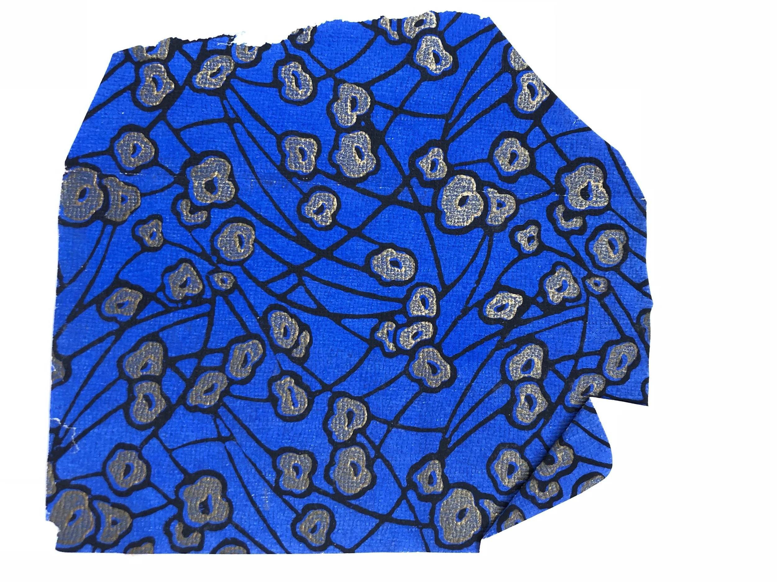
I’ll explain more here in the coming months, but I wanted to start with an example that I have been seeing in art, fashion and nature. Starting simple with color, I have been obsessing over International Klein Blue. What exactly am I talking about? The history of International Klein Blue is quite fascinating and Paris based trend forecaster, Erin Burke and I have been seeing the color from Miami to Paris to Antwerp. I am continuing to see the heavily pigmented and saturated blue paired with pastel pinks, peaches and purples, making for an interesting color grouping. See below, the pics I have taken or the runway images that have started to create this color palette. Since it’s popping up in luxury design and on the runway, it means there will be a trickle down effect at some point.


Recently, some of you have privately shared photos of colors you have seen in your day to day lives because of one of my color posts and my intuition says we should start looking together even more and featuring our photos. So, if you want to try your eye at finding a version of International Klein Blue or it’s pairing with the pastels, as you’re out in the wild, tag your pics on Instagram or Facebook with #lookifoundacolor - I would love to start a color and pattern community and share what everyone finds! Join me on a trend safari and let’s see what we discover together.